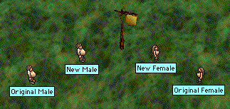
Halflings are showing off a possible new look in the Fairgrounds. What do you think?
Posted by Para at June 19, 2003 03:27 PMLemming!
Posted by: Opxe on June 19, 2003 03:40 PMI like the new female.
The new male looks a bit scary in my book...
but I am just a small fen 8)
How do they see now?
Posted by: Snuggle Bear on June 19, 2003 04:12 PMMaybe it's me but the female halfling's face and chest look flattened when she's standing to the se or sw. I also don't like how the belt has become narrower. The shading on the clothes is improved although it would be nice if the hair also had additional shading. It also would be nice if a mouth was given in addition to the eyes. The poses are a nice improvement overall.
Overall it's a good set of icons but they need a bit more changes to be truly polished in my opinion.
Posted by: Jeanne on June 19, 2003 04:17 PMI like the new female a lot but frankly I think the male is pretty bad. It's sqaure and not nearly cute enough for a halfling
Posted by: Haze on June 19, 2003 04:23 PM"Lemming"??
Posted by: Para on June 19, 2003 04:26 PMI must say, the newly-hatched young of both the Halflings and the Dwarves will never lack for food!
Posted by: Tad (the Thoom) on June 19, 2003 04:53 PMI don't particularly care for them; but then, only sylvans have ever possessed a true beauty. Except perhaps Babajaga, recently revealing her "inner Prue"
Posted by: Wangah Rah on June 19, 2003 06:37 PMI'm still not anatomically correct, but then.. neither was Barbie or any others I can think of. And it may be me, but I swear I'm even perkier than before. I like that I can see now though! Thanks! To be perfectly honest the differences are mostly too subtle for my non-artist eyes. I like them both. The male posture is better on the old one I think... floppy feet and droopy shoulders... sounds about right. Kudos to the artist all around though! Why not leave them both in. :-)
Posted by: Jazz on June 19, 2003 07:59 PMThanks Para.
Posted by: Habbakuk Lal on June 19, 2003 07:59 PMThanks Para.
Posted by: Habbakuk Lal on June 19, 2003 08:00 PMLike many other improvements in CL, people will dislike it only because it is a change. These icons are much nicer any way you slice it. Hooray for eyes. :)
Posted by: Sutai on June 19, 2003 08:49 PMNot all changes are an improvement in every possible way and saying that people who criticize changes don't like changes at all is a mischaracterization.
I think the new halfling icons do have many improvements but they also have some downsides as well. I list both so the artist gets feedback which is why I thought the halfling icons were placed in the Fairgrounds instead of being placed in the game immediately.
Posted by: Jeanne on June 19, 2003 09:44 PMThese icons are much more subtle, I believe. As said above, kudos to the artist. I always like to see some of the older, clunkier graphics get updated a bit.
Speaking of which, that Healer's Temple is looking a bit dated. No wonder there aren't healer classes or a fifth healer circle, we don't have the facilities. We need a Healer's Temple upgrade. Anyone been watching 'This Old Temple' lately?
Posted by: Snuggle Bear on June 19, 2003 11:50 PMI hate to have to say it, but I like the old me better. I don't hate the new icon, but I'd like to have a choice.
Posted by: Violet on June 20, 2003 05:32 AMI hate to have to say it, but I like the old me better. I don't hate the new icon, but I'd like to have a choice.
Posted by: Violet on June 20, 2003 05:32 AMUhmm...what are the differences?
Posted by: Merlisk on June 20, 2003 06:35 AMNot much Merlisk.
They have eyes now, and better shading. The males have a smaller beer belly, which makes their body look longer.
Posted by: Baff on June 20, 2003 07:15 AMNot much Merlisk.
They have eyes now, and better shading. The males have a smaller beer belly, which makes their body look longer.
Posted by: Baff on June 20, 2003 07:15 AMOkay having actually tried the new icons last night I really like the new ones much better.. if only because of the better "shading" or whatever.
PS - Sutai... you should have been a Halfling. ;p
Posted by: Jazz on June 20, 2003 01:58 PMEyes are A Good Thing.
Posted by: Polerand on June 20, 2003 03:07 PMI think the new icons are good, but the old icons are better, the main reason being the /poses. I like the old /poses because they are so silly!
And is it me, or does the new halfling's face look smushed?
Posted by: Sognus on June 20, 2003 08:33 PMI think they're grand! I always hated the crystalball-on-a-stick look of the old females. If this offends Jeanne in any way, I won't be suprised. ;)
-Squirrel
Posted by: Squirrel on June 22, 2003 11:10 AMThey look fine. What I want to know, do they taste better?
Posted by: His Majesty Odesseus on June 22, 2003 06:12 PMI'm with Sognus on the old silly poses, at least for the male. Keep halflings cute!
But then, this is the same reason why I want the male human poses to stay the same, so what do I know?
Posted by: Haze on June 23, 2003 02:14 AMI'm with Sognus on the old silly poses, at least for the male. Keep halflings cute!
But then, this is the same reason why I want the male human poses to stay the same, so what do I know?
Posted by: Haze on June 23, 2003 02:15 AMI think they're grand! I always hated the crystalball-on-a-stick look of the old females. If this offends Jeanne in any way, I won't be suprised. ;)
-Squirrel
I never said that halflings didn't need a makeover and agree that the current look is a bit silly since the females do have too big of a head.
Why would I be offended even if we did disagree in this instance?
Posted by: Jeanne on June 26, 2003 02:16 PM